|
Notes On Working With Computers From 1988 To 2002
James Faure Walker, 2002 1988 to 1993
Before Computers I left the Royal College of Art in 1972 (where the Cartographic Department was rumoured to have a computer courtesy of the CIA, processing defoliation data for the Cambodian bombing) and had seen ‘Cybernetic Serendipity’ at the ICA in 1968, but it wasn’t till well into the eighties that I really got stuck into computers. In the seventies my main preoccupation was painting, and it still is. In 1974 I also began writing criticism, initially in Studio International magazine. At the time conceptual art was in the ascendant. I had worked as a draughtsman for Sol Le Witt, but I grew to reject the pretensions of minimalism. There wasn’t a real gain over a more full-blooded approach to painting – I had been won over by the de Kooning retrospective of 1969 at the Tate. Out of frustration with the way painting and sculpture were poorly represented, virtually excluded from serious critical coverage, four of us started an art magazine, Artscribe in 1976.[i] After a year, I became the editor, and continued writing and editing till 1983. By then Artscribe had become the principal journal of contemporary art in the UK. It folded in 1991. I only started using a computer intensively – an Apple II – in 1988. I should mention that during my time as an editor the subject of computers and art seldom came up at all, except as a round-the-corner technology that would accelerate much of the graphic processing that goes into magazine production. I was fascinated by Harold Cohen’s demo of Aaron at the Tate in 1981, and I have one of those drawings. Beginnings We take the speed and ease of use of today’s computers for granted, and I have to make a mental effort to recapture the exhilaration of working for the first time on programs that actually used colour, perhaps just eight colours, and forms as blocky as Lego. I used a primitive precursor of the Wacom tablet, a wooden stick-like ‘pen’, and an inkjet printer that needed homemade software to drive it, and thus came out with oranges instead of green, and so on. My approach was that of the blind enthusiast, well capable of boring my painter friends rigid with my talk of new psychedelic worlds being revealed in these new jets of cyber consciousness. I was excited by each new paint program: Dazzle Paint, Deluxe Paint (through all its versions and amazing animation); from PhotoLab to PhotoShop, Photon Paint, Digi Paint, Pixel Paint, Studio 8, Studio 32, Oasis, Graphis…. and there were also the bespoke systems, Quantel, Matisse, Getris and so on, that were financially completely out of range. At the beginning of the nineties Painter came along, a program that could simulate paper texture and the bristles of a brush, with wonderful new features added with each upgrade – ‘floaters’ that anticipated Photoshop’s layers, animation, impasto, dripping paint. It evolved alongside the staggering increase in performance of the hardware – including digital cameras and printers – which actually became more affordable year by year. Overcoming the Limitations I was no pioneer, and definitely an amateur, hardly able to program, and working in relative isolation. There was a computer art show in Middlesborough in 1988 that I took part, and met Simon Biggs, William Latham, Stephen Bell, but there was no community in the way such as there was for painters. My gallery at the time was sceptical about exhibiting the computer works I was doing. The art world was ambivalent about ‘computer art’ - especially art schools - if not openly dismissive. It was just considered to be bad as art, something done by scientists or graphic designers. For years I hardly exhibited my digital work, at least not in the UK. I wanted to share my thoughts about what I was discovering day by day, but I didn’t want to re-enter the polemics of art criticism, which had consumed me up to 1983. I had to be self-sufficient, not only in terms of equipment and maintenance – bear in mind how much more expensive everything digital was then – but in terms of morale. There were no signposts pointing the way, few exhibitions, no newspaper reviews, and no internet forums - such as Rhizome, which I joined in 1996. Looking back on some of the work I did then, I can see this gave me a certain strength. I was preoccupied with overcoming technical problems. I had to cheat the system to achieve a decent colour range, and a larger scale. But in finding a solution, or at least coping with the given limitations, I laid the groundwork for the themes and structures I was to work on years later. For example, in the eighties and early nineties I was usually working on an Amiga with I MB RAM, and no hard disc. There was no affordable way of printing an image much larger than 6” x 8” (15cm x 20cm). So I simply doubled the width, or assembled a composite image in a 3 x 3 matrix, thereby expanding both memory and the scale of the image. This was a new way of thinking about a composition, an image that you could not see as a whole till printed and assembled. Then as now I was working physically on paintings, and simultaneously on digital ‘paintings’ – I use quotes because it was a difficult concept to swallow. Neither the paint program nor the inkjet printer could handle the subtleties of photographic - yet alone ‘painterly’ - tonality. You had to improvise and make do. The needlepoint texture of the inkjet – I used a Xerox 3020 - was comparable to the effect of canvas, and by careful construction you could hide the joins when making the larger composite image. By taking advantage of the thin inkjet paper you could lay sheets over each other to create extra colours. At this stage there was no question of a ‘computer print-out‘ competing with ‘real’ painting. There was no smooth gradation, no infinite colour range, none of the texture, malleability, or range of brushes. Digital painting existed in the make-believe world of the miniature: flat colour areas, jagged lines, and geometric forms. So it was reasonable to expect any new ‘digital’ art form to evolve away from the original discipline. But I found the connection too interesting, and wondered whether the creative open-ness of the paint program could be integrated into the conventional methods[ii]. 1994 – 1998 The broader view I had begun teaching at the RCA’s Computer Department in 1989, and soon discovered the magic of the little Canon digital camera there – it stored images on a tiny disc. I didn’t acquire my own (an Apple QuickTake) till 1994 - again, by today’s standards this was ridiculously expensive. I began taking photos wherever I went, of anything – the road, taps, trees, people, walls, no parking signs. I incorporated the photos like ‘found’ optical texture. It wasn’t just the new gadgetry leading me along: I had exhibited some pieces in the 1990 ISEA Groningen exhibition but hadn’t attended the conference. In 1993 I exhibited at ISEA when it was held in Minneapolis[iii]. I also went to the ISEA in Helsinki in 94 (and in fact to every ISEA since). Not only did these marvellous conferences make many of us feel part of a community; it also began to establish some basic criteria. In my case I saw all too clearly my own shortcomings – I should be far more ambitious Partly this meant joining – or not joining – the techno race. Special effects and Art Distinguishing between high-performance hardware – anyone with their hands on a Silicon Graphics machine looked light years ahead – and what you might graspingly call ‘art content’ was always an issue. Char Davies` Osmose VR piece shown at ISEA Montreal in 1995 really brought this question to the fore[iv]. It offered so much more than a conventional painting in terms of ‘interactivity’ and its ’immersive’ space. It also meant that if you were to work with more limited resources, and remain more or less in the territory of painting – still image and 2D – you had to be especially clear and determined. There would soon be nothing special – no longer a circus trick – about the ‘computer-generated’ image. This seems obvious now, but at the time it had been like a collective love affair with this super-intelligent technology, the drawing machines that renaissance artists would have dreamed about. At trade shows audiences gasped at demos of the Quantel Paintbox. Nowadays the most spectacular effects - I’ve seen rows of SGI`s chained together to run a vast game featured at Futurescope – meet with a shrug. Texture So there were plenty of difficult questions about how artists could be involved: Should they become special effects engineers? Should they try and subvert the whole theme park ethos? Should they retain the more or less traditional modes? Was there to be a completely new art, without connection to the past? What came to be important was not that there was any one answer, but that here was an international community of artists that was searching for answers. As I got to know some of the artists, I was sometimes struck by the discrepancy between their open and interesting personalities and the anonymity of their images. Generally speaking, the exhibitions were too close to the technology, too impersonal. Some saw this anonymity as necessary, as symbolic of the ‘cyber’ aesthetic, of a virtual and alien world. But it spurred me to work on everyday themes, on the particular, on texture: to look for the specific character of a given place, its temperature, its population. Pedestrians I photographed many of the walls, and crumbling textures around the railway arches near my studio – some of which were incorporated in pieces like Die Formes, exhibited at Siggraph in 95. One detail began to preoccupy me: inevitably passers-by found their way into the images, walking across the field of vision. Then while waiting for a film in Leicester Square, I noticed a family arguing about whether to go to Pizza Hut or Burger King. I photographed them, and realised there was a possible subject there. I kept returning to the same spot for several weeks, till I had photographed hundreds of people – my QuickTake camera could only manage 8 shots – I can now easily take 400 in one session. I spent many more weeks trying to make sense of these images, eventually discarding a documentary approach in favour of a matrix against which the figures would create a pattern. I realised there was something here that I could develop much further. One problem that faces any painter is a kind of shape blindness: you work on certain visual themes year after year, and while you inch your way forward, you become incapable of recognising the obvious. This is especially the case with abstract painters. In my case I knew intuitively that I needed a wider set of contrasts, that what I was achieving, albeit on a small scale, in the digital work was more interesting. It was while working on a ten-foot canvas, where I had improvised a design in greys and browns that I wondered about imposing profiles of back-packers. Deducing that Russell Square, near the British Museum, was a good place to start I photographed backpackers, but only if they were carrying maps. For a while I was producing both paintings and digital works from the same sources. Converting the digital image into the painted image could be labour intensive, cutting out stencils, painting the image square by square, but I began to achieve the necessary degree of contrast. Undecided: Lost in Aesthetics, Shopping and Kitchen Distractions
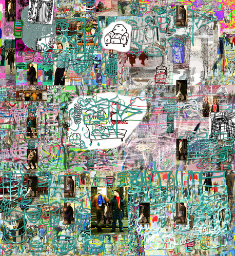
1997 87 x 80, inkjet print The Undecided Theme
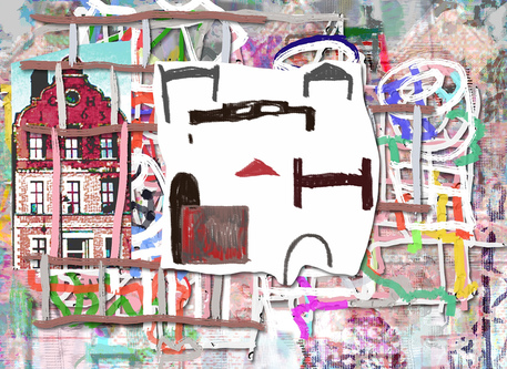
In 1992 and 1994 I had written articles on digital art in Modern Painters. I wanted to communicate something of the excitement I felt. There was still no proper outlet for exhibiting in Britain, and no forum for sharing information. The RCA had closed its Computer Department. An ambitious exhibition I was curating in 95/96 for the Croydon Clocktower was scrapped late in the day[i]. There was little prospect of securing any teaching where my interests would be relevant. This made me think – defiantly perhaps - all the more about the direction I should take. I resolved to bring the digital and painting closer together, and to think in more of a poetic dimension. Just as a poet or writer can use their everyday experience – frustration with their career, or the pause while you drink a cup of coffee – as a focus point, so I should be able to make images out of everyday thoughts, like a diary. One result was the series ‘Undecided’, especially the first picture: ‘confused by the aesthetics of digital art, shopping, and other distractions’. 1998-2002 Changing Climate Gradually the climate began to change. Late night TV shows featured discussions on the new and cool wired culture – there would be plenty of cyber graphics, a set of primary coloured pipes. Courses sprang up for computers and fine art – the best were sometimes in the less prestigious colleges such as Tower Hamlets. Computers and printers themselves were becoming commonplace. When I gave lectures there would now be several digital artists in the audience asking questions. Sue Gollifer initiated the Arcade exhibitions, Colville Place Gallery opened, Anne Morgan Spalter`s ‘The Computer in the Visual Arts’ appeared in 1998. At the same time ‘computer art’ gradually evolved into ‘new media’ and the gap between non-digital and digital art began to disappear. There were still quite fierce discussions about the supremacy or otherwise of an ‘algorithmic’ approach – where the artists was a programmer rather than a consumer buying off the shelf software – or of whether the future lay in VR, interactivity, or in the emerging net art. But it also became clear that no one way of thinking was to have the monopoly; this previously underground, or fringe semi-movement was fast merging into the larger world of art, with all its diversity. This meant, for example, that I came to feel less of a split between painting and the digital, because the Great Leap Forward – where some were expecting non-digital artists to down tools in 2000 and convert to ‘dematerialised media’ – clearly was not going to happen as planned[ii]. In addition the art world in Britain was undergoing an extraordinary transformation centred on the success of the Young British Artists. Events such as the Turner Prize, the Sensation exhibition at the Royal Academy in 1997, and the opening of Tate Modern in 2000 completely changed the public profile of contemporary art. From being one of the least supportive centres for young artists – a number of my contemporaries had emigrated to the USA or Australia – all of a sudden London was the place to be. I mention these changes going on in the background to suggest the context in which my own ideas were falling into shape. It is not that I responded directly to these events, but I found myself in a new context where promptings came from unexpected quarters: invitations from the USA to lecture and exhibit; a possible project for the BBC`s News Centre; an invitation to write a column for CGI magazine. In 1998 I won the Golden Plotter prize at Computerkunst, in Gladbeck, Germany. The Colville Place Gallery linked up with the Galerie der Gegenwerk in Wiesbaden. There was a real network where before there had been a vacuum. The German Hospital 1998 42 x 58, inkjet print
Colour and Drawing
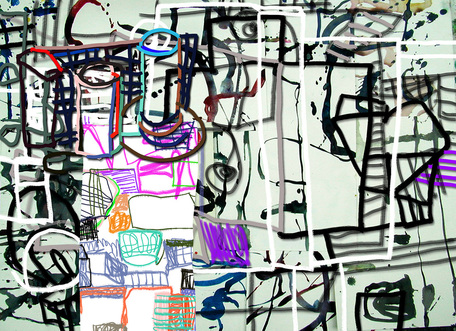
In 1998 I became fascinated with a local building, the German Hospital in Dalston, built in 1863. I made some pictures out of my researches, and began to develop a way of building up a picture around a central theme – I went on to create pictures from photographing pigeons, from the early planes, models and photographs I came across in the science museum in Milan; from a model toyshop in Dr Johnson’s House. I also came to think a lot more about drawing, realising that much more was possible within the paint program than was possible within normal art materials: I could have a more complex space, a wider variety of line; I could draw in colour, have a clearly structured sequence of layers, like drawing on a series of sheets of glass; in the process of making the drawing I could have resource to animation, or take colour samples from objects around me that I photographed. So a series began which I called ‘Colour and Drawing’[i]. ‘From a Garden Table’ was the first, and later examples included ‘Blue Square and ‘Dancing Tea-Cup’. Forms in Motion: Choir 1999 56 x 71, inkjet print
Forms in Motion
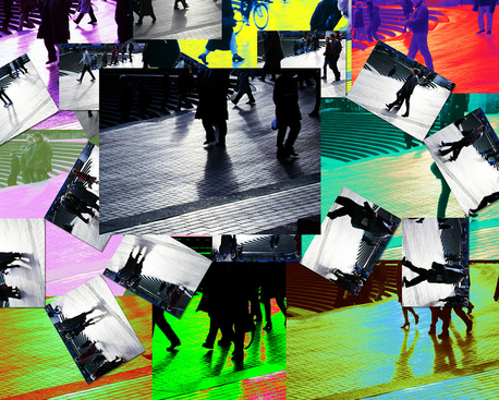
I also set about developing a more coherent format for the works where photographed figures were the main component. My new Nikon CoolPix camera far exceeded my QuickTake in what it could do, and one feature I explored was the capability to capture a few seconds of movement. I could photograph any number of scenes – traffic passing, people shopping, station forecourts, and find compelling sequences. Sometimes I played around with these sequences, turning them back into animations, or re-colouring them in different ways. This series I called ‘Forms in Motion’, the first ones being ‘Arch’, ‘Choir’ and ‘Fugue’, each referring to the structural ideas. A further change to my working method, in part stimulated by the fact that I was exhibiting and selling some of this work, was that the final format was now an Iris print. This is a relatively expensive way of producing the image, but the print has a body to it, and a colour saturation that cannot be achieved by regular consumer printers. It can also be printed on a larger scale, on ‘fine art’ paper such as Somerset, and the ink and paper are archival. Does this mean that the spontaneity and throwaway character of the medium is lost? Yes, but the prospect of turning an idea into this highly defined product forces you to go much further, trying numerous variations before opting for the final version. Fierce Curves 2000 48 x 69 cms, archival inkjet print
Fierce Curves
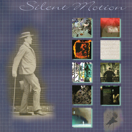
The third issue I set out to work on more thoroughly was the gap between the two parallel streams of work – physical and digital. I was swapping motifs from one to the other all the time, but with the improved camera, software and printer I wondered whether I could develop some more interesting connections. For example, in further Forms in Motion works I used collages of watercolours as a background, but I liked to photograph the watercolours when they were still wet. For this reason I came to make watercolours on the floor, specifically to be photographed. ‘Fierce Curves’ is a case in point. The idea was not to blur the difference between a digitally drawn line and a painted one, but to take advantage of the subtle differences. Clearly this had an impact on the way I was painting physically, in that I realised how effective it could be to juxtapose these different modes. Catalogue of ‘Silent Motion’, curated by James Faure Walker, 2001,
Stanley Picker Gallery, Kingston University, and Colville Place Gallery. Silent Motion
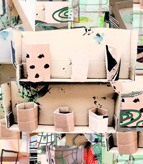
In 2000 I gained a position at Kingston University as a Senior Research Fellow, and was asked to curate an exhibition at the Stanley Picker Gallery with an art/science theme. Having visited Kingston Museum, and having been preoccupied with images that recalled Muybridge`s experiments of the 1880`s, I came up with the idea that became ‘Silent Motion’[i]. It was a group show juxtaposing Muybridge`s original photo-sequences with works by ten contemporary digital artists. It allowed me to speculate on the links between the pioneers of photography and the tentative experiments we were making as digital artists. One by-product of the research was the Friese-Greene series. I photographed his early movie-cameras, and combined the images with glimpses of figures in motion. Cardboard 4, shelf with objects 2001 56 x 51 cms, archival inkjet print
of Cardboard
One method I am using helps me develop an interesting play of shapes, marks and texture. I collect old pieces of cardboard, paint them here and there, cut them into various shapes, assemble them into shelves and boxes, and arrange them on the wall. I do all this as fast as possible. The wall relief only exists for the half hour I spend photographing it. I take perhaps fifty shots from different angles, distances and in different lighting. I then reconstruct the relief digitally adding some marks, subtracting others. In effect I am creating something quite different from the original. The thinking behind this is to create a ‘third space’, neither digital nor painted, out of which the image can emerge. In some pieces the rules are closely followed, in others they are relaxed, so for example, a passing spectator appears in the image as if reflected by the glass. It is a way of juxtaposing the drawn, the photographed, the painted. Blue Bowls derived from a plate I came across in the Victoria and Albert Museum. I made a quick sketch and combined derivations from this drawing with watercolours and cardboard forms. A line drawn in paint has one character, the same line photographed has another, and the line drawn digitally has a third. New Media art in general is now receiving much more attention, particularly web art. The focus is on manifestations that are furthest away from ‘traditional’ formats. The category I find myself in – the 2D still image – is hardly at the forefront. No matter. The technology is incomparably better than it was. The relation between physical and digital painting has now shifted right round. Not only can the paint program do more or less anything that you can do physically – Painter 7 has texture, dripping paint, the works – but the giclee Iris Print has the visual weight of a painting. The pressure is now on the physical painter to make the paint perform with the versatility of digital paint. In the long term digital painting may prove as indispensable as oil paint, as radical in its impact as photography. Or it may turn out to have been a cul de sac. James Faure Walker __________________________________ [i] See 5 x 20 catalogue essay. [ii] See ‘Painting with the Computer’ Modern Painters, Summer 1992. [iii] See ‘Art and the Intelligent Lunch-Box’ Modern Painters, Spring 1994. [iv] See The Outside and Inside of Techno Art’, Mute 1995, on SIGGRAPH 1995 and ISEA 1995 Montreal, also published in the ISEA Newsletter 1995. [v] See ‘High Culture meets Mall Culture’ Wired (UK), December 1996. [vi] These were questions I discussed in columns for Computer Generated Imaging from 1997-9. For example: Learning the Theory (2), review of Chicago ISEA (4), On Print, Pigeons and the Infinite (6), On Educating Digital Artists (7). [vii] For a fuller account of these ideas see ‘The Colour and Motion Series’ catalogue, Colville Publishing 2000. [viii] ‘Silent Motion’ 2001 published by Colville Place Gallery Publishing. The artists in the exhibition were: Victor Acevedo, Anne Baker, Andrew Carnie, Hans Dehlinger, James Faure Walker, Lane Hall & Lisa Moline, Rejane Spitz, Annette Weintraub, Jody Zellen, and Eadweard Muybridge. Notes On Working With Computers From 1988 To 2002, James Faure Walker, 2002 Download a PDF of the article |
